An app that creates money-smart teens
Cashee gives teens in the Middle East a digital platform to manage their money. Simply sign up, order your VISA card, and start spending, saving and earning with ease. It’s the perfect way for parents to teach their kids how to become financially smart.

A safe and secure way to help teens learn how to spend, save and earn money, the right way
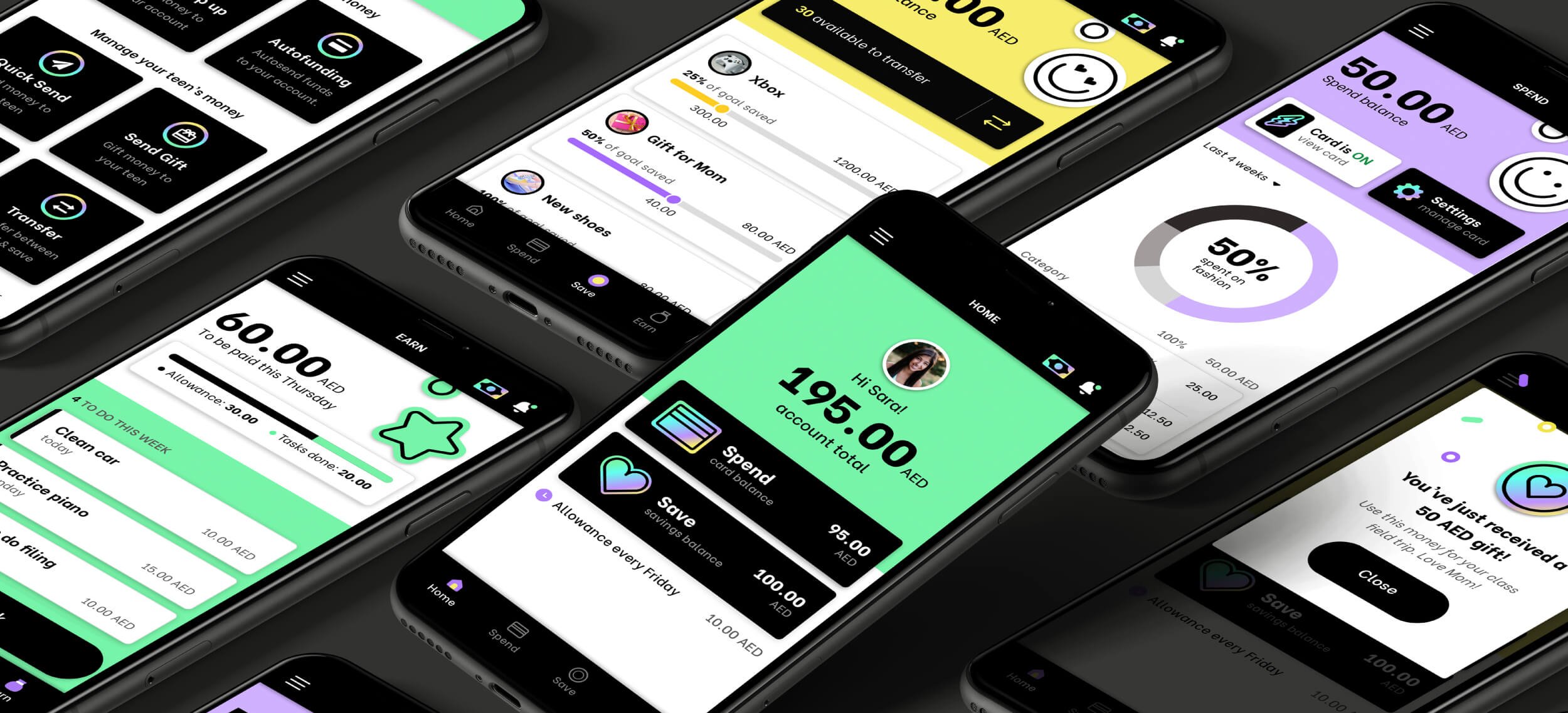
With the Cashee VISA card and app, teens can receive their allowances with ease, earn money for tasks completed, and set savings goals. It’s the perfect way for teens to learn how to budget, and start spending wisely.
The Cashee team approached us to work on the UX and UI side of the project. Our brief included coming up with the brand’s look-and-feel, designing two app experiences, one for parents, and one for teens, and designing a marketing website that stands out from the crowd.
We worked closely with the talented developers from Rirev, to turn our designs into fully-fledged Android and iOS native apps.
One app, with two experiences. One for parents, and one for teens
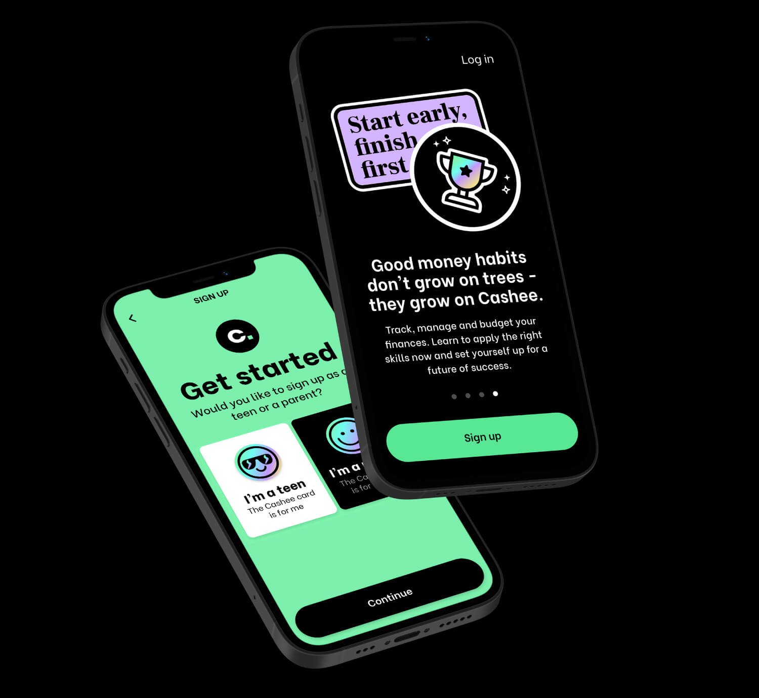
Cashee gives both parents and teens access to two different experiences.
Parents can:
Automatically send weekly allowances to their teen’s VISA card
Send money whenever their teen needs a little extra cash
Set controls, such as spend limits
Create tasks and saving goals for their teens
Receive real-time alerts on their teen’s spending, goals, and tasks
Teens can:
Track their spending
Make purchases online and in stores with their VISA card
Set and track their saving goals
Complete tasks for a little extra money
Receive real-time alerts on their spending, goals, and tasks
Making finance for teens simple with a user-friendly app
Cashee is not only a financial app, it’s an educational app. It teaches teens how to become financially happy, and healthy. That’s why we needed a user experience that guides them thoughtfully through this learning process. We spent a great deal time focusing on the experience through various wireframe iterations. We had to ensure that both parents, and teens had a superior, and user-friendly experience, in order to trust Cashee with their financial needs. Once we had a solid foundation, with both the parent and teen’s app working friction-free together, we started working on the brand look-and-feel.
A brand that makes you smile
Cashee wanted us to create a brand that was slightly edgy, modern, and nothing like their competitors. Because we wanted the interface to be simple and distraction-free, we decided to go a little wild with the colour palette. Colour was an easy way to get the “cool” look we were after. Add in a few illustrations and voilà, we have an exciting user interface that’s still clean and fuss-free.
We were also tasked with coming up with a look-and-feel for their social pages, as well as their VISA card designs.


