Top 7 website design trends for 2020

When designing your site, should you follow a trend, stick to the classics, or stand out with something completely unique?
The desire to defy trends and create something that’s one-of-a-kind sounds great... in theory. Truth is, most sites aren’t unique works of art, and seldom do they completely break new ground.
“Not even the really good ones?”, I hear you ask.
“No, not even the really good ones... Ok, maybe the really, really good ones,” but those are few and far between.
Trends exist for a reason and knowing how to make use of them can benefit your brand. The key here is strategy. I’m going to unpack this a bit more, but for those of you who want to jump straight to the eye-candy, here are some quick links:
Top 7 website design trends for 2020
1. Hand-drawn elements for extra personality
2. 3D illustrations with the wow factor
3. Overlapping elements & white space
4. Dark designs & sites with a night mode
5. Hamburger menus & minimalistic navigation
6. Interactions & microinteractions that delight
7. Combining photos with illustrations
Congratulations!
If you’re reading this, it means you fought the temptation to skip ahead and are about to find out how to use trends to your advantage.
But first, we need to answer an important design decision: Should you follow a trend or opt for a more signature style? These questions will help you decide:
Should I follow a web design trend?
Does the trend suit my brand?
One size does not fit all with design. Ask yourself what your brand is about. The answer lies deeper than the products you sell or the services you offer. It’s your core brand values; the personality you want to communicate to your customers. Only go with a trend if it’s true to your brand identity.
Still trying to nail down your brand personality? Check out this Easy Guide to Find Your Brand Voice (w/ Free Questionnaire)Does my site need to be trendy?
Are your customers trendy people? Do you need a fashionable site that feels up to date? If you answered “yes”, following a trend could help to show that your brand has its finger on the pulse. Note: if your brand falls into this category, it’s a good idea to make frequent updates to your web design.
What’s the purpose of my site?
Just about every company needs a website to market their products or services, right? But what if you need to sell an idea to investors? Or perhaps you have a brand-new product that you’re not sure users will understand.
Making use of a design style that users are familiar with, or aligning yourself with others in the same field can sometimes help to get a concept across more easily.
Does the trend speak to my users?
You know your target audience and you probably have a good grasp of what they like and what they don’t. If not, why not conduct some interviews with your customers to find out? Choose a design that speaks to them. After all, they’re the ones you need to impress!
Ok, so you’ve gone through those questions and have decided that a trend is the way to go. Good news - this doesn’t mean you have to throw originality out the window! Take a trend, customise it to your brand, and you’ll have a site that feels authentic and looks great!
Below is a list of trends that you can use as a springboard for your web design, as well as tips on when to follow which.
Here are the 7 biggest web design trends of 2020
Hand-drawn elements for extra personality


by Mailchimp

by Whiteboard
Follow this trend if: You want your brand to appear friendly to users. Using hand-drawn illustrations, imperfect shapes, and handwritten text on your site can make your brand more approachable. Another bonus is that it can give you a memorable signature style! We expect the number of brand-tailored illustrations to increase across the web in 2020.
Don’t follow this trend if: You want users to see you as a no-nonsense, “let’s get straight down to business” operation. A lighthearted approach doesn’t work for every website.
2. 3D illustrations with the wow factor


AirPods Pro by Apple

by Toggl
Follow this trend if: You’d like to wow users with impressive imagery showing technical prowess. This trend goes hand-in-hand with immersive web experiences, which are designed to blur the line between reality and the web. Bear in mind, to get this trend right you’ll need a digital team with a specialised set of skills.
Don’t follow this trend if: Your budget is limited. 3D illustration and animation can come with a hefty price tag. This trend also requires devices with high processing capabilities, meaning your site will run best on high-end devices or smartphones. Download sizes also tend to be quite big, so don’t follow this trend if your users are sensitive to high data usage.
3. Overlapping elements & white space


by Lifted Logic

L.E/Miami by This is Beyond Ltd.
Follow this trend if: You’re looking for an elegant design that uses negative space to its advantage. The combination of white space and overlapping elements is a great way to highlight certain information and organize content. Soft shadows can be added to create visual interest and give your site a subtle 3D feel.
Don’t follow this trend if: You don’t like it. It’s as simple as that. Well, actually - not really - as what you like is less important than what your users like, but you get the gist. Note: this trend has been around for a while, so while we expect to see more of it in 2020, it might not have as long a lifespan as some of the others in this list.
4. Dark designs & sites with a night mode


Follow this trend if: You care about the environment and about your users. Seriously! Dark designs don’t only require less power (a big check next to the “earth-friendly” box), but they also reduce eye strain, making them better for your users’ eyes (triple bonus: this could lead to longer browsing times, which can’t be bad for business either!)
Don’t follow this trend if: Dark colours don’t work with your brand. You don’t want users to visit your site and not recognise you! If you’d like to follow the dark mode trend but your current brand identity is light, why not transition your users by giving them the option to switch your site to “dark mode”? In time, users may start to associate darker colours with your brand, allowing you to go “full dark mode” in the future.
5. Hamburger menus & minimalistic navigation


by Make Happen
Follow this trend if: Your users are tech-savvy and accustomed to hidden menus. Works well for sites that display their key features out in the open on the homepage, and don’t rely on menu items to guide users. Also super nifty for sites with limited screen real estate.Note: this is not really a “trend” on mobile devices as hamburger menus have been around for ages, but we expect to see more and more of it on desktop.
Don’t follow this trend if: Your users rely on cues from menu items as to what features are available to them (this is often true for users who spend less time on the internet). Also, hiding your menu puts an extra step between your users and your content, so might not be a good idea for online shops, or sites that rely on repeat visits.
6. Interactions & microinteractions that delight


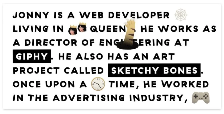
by Jonny McLaughlin
Follow this trend if: You’d like to delight your users with unexpected details as they interact with your site. Whether they’re selecting a button, scrolling down the page, hovering over an image… you name it… using microinteractions to give users feedback is a great way to enhance their experience.
Use this trend to give your site a more “human” feel, and allow users to interact on a level that feels tangible.
Don’t follow this trend if: You don’t trust the instincts of your design and development team (a sign that it might be time to find someone new!) Just like any form of power, interactions can be used for good or bad; and badly implemented interactions are a quick way to frustrate users!
7. Combining photos with illustrations


by Calexo
Follow this trend if: You’d like to add a little something extra to your photography. Not only does this imbue your site with personality and make it more memorable, but it can also help transform bland product photos, explain complicated features, or visualise abstract concepts.
Don’t follow this trend if: You love your photography as is. Sometimes it’s a shame to crop or cover beautiful photos, especially if they’ve been taken by a professional. A great photographer knows what they’re doing, so adding illustrations might just throw off a carefully-constructed composition.
Top website design trends for 2020: Wrap up
So there you have it! We’ve trawled the internet to bring you our pick of the top web design trends for 2020. Now it’s up to you to use these trends to your advantage!
As long as a trend enhances your site’s usability rather than detracting from it, we say GO WILD! If you keep the focus on your users and stay true to your brand values, you can’t go wrong.
Need some guidance getting your site started? Why not check out The Marketing Manager’s 10 Step Guide to Website Design?