5 Squarespace sites we love and why
I know you’re not supposed to play favourites, but as far as website builders go, Squarespace is definitely mine!
It’s an easy-to-use, drag-and-drop website builder - and it’s brilliant!
We’ve collected the 5 Squarespace websites that we think truly live up to the Squarespace slogan: “build it beautiful”.
Squarespace website designs - Our top picks
1. Dreaming with Jeff 😴
Come to think of it, I don’t think I’ve ever met anyone who doesn’t like Jeff Bridges. I mean, what’s not to like?
And just to make him even more likeable, he’s released a set of Sleep Tapes to help all those restless souls out there get a good night’s sleep. What’s more - the proceeds go towards feeding hungry children in America!
Oh Jeff, you truly are "The Dude"!
Why we love the Dreaming with Jeff site:
Jeff Bridges is involved. Nuff said.
We love the magical and mysterious style of the graphics. They all work together to evoke a trippy kind of dreamscape.
The colour palette is dark and muted - perfect for a site about helping people get to sleep.
The site looks great on desktop, and mobile devices.
We chuckled at the quirky video!
You can listen to the Sleep Tapes audio directly on the site, or can download the album.
Check out the Dreaming with Jeff site here. Then all that’s left to do is sit back, close your eyes, and nod off.
2. Aesop Wines 🍷
Aromas of guava, watermelon, cherry blossoms, key lime, pear, and wet stone - mmm… Even if you don’t like wine, that description sounds heavenly!
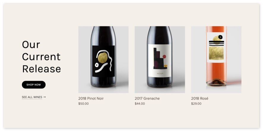
Aesop is a Napa Valley based winemaker. They source sustainably farmed fruit to make their small batch, handmade wines. They promise their customers, “premium quality winemaking with quietly beautiful design.”
After seeing their site, I can attest to the “quietly beautiful design” part - they’re definitely living up to that promise, and I have no doubt that they’re fulfilling the “quality winemaking” part too.
Why we love the Aesop Wines site:
They made a risky font choice, and it paid off! The sans-serif / serif combination, as well as the use of italicised copy interspersed with standard text, works beautifully to give their site a distinctive look.
We love their clean product shots, and their dreamy-Sunday-afternoon lifestyle shots.
They’ve combined large areas of black with sections of lighter, muted colours giving the site a memorable colour palette.
The list of 13 things we believe on their About page is an effective way to communicate their brand promise.
Their Lookbooks page is a great idea! It’s kind of like a blog, but also a way to show off some of their beautiful photography.
If you take a look at the Aesop Wines site, you’ll notice a lot of overlapping elements combined with white space. This was one of our predictions for the Top 7 website design trends for 2020. Check out the rest at that link.
3. Supernatural Kitchen 🍰
From wine, to baking and cooking - things sure are getting tasty!!
Supernatural Kitchen provides ethical chefs with plant-based food colours, dye-free sprinkles, and other vegan ingredients for foodies who like to get creative! Plus - all their products are palm oil free - yes! (Say NO to palm oil 👎, and YES to orangutans 👍🐵!!)
Supernatural Kitchen is doing a lot of good, and to top it all off, they have a beautiful website too!
Why we love the Supernatural Kitchen site:
That banner image on their homepage - wow! I can almost taste the ginger and salted caramel...
We love their quirky copy: “More fun, less Frankenstein” to describe their all-natural food colours = pure perfection.
Emojis for favicons don’t always work, but the infamous Smiling Face with Heart-Eyes 😍 emoji seems to encapsulate their brand perfectly!
The combination of beautifully-written copy, and silly gifs makes for an About page that you actually want to read.
We love that they’re doing their bit to help the planet by offering plant-based, vegan, palm oil free products.
If you love making delicious food with creative ingredients, and like to spend time ogling beautiful websites, check out the Supernatural Kitchen Squarespace site and be inspired!
4. Caylon Hackwith 🐚
To me, Caylon Hackwith’s site feels like a calm day on a deserted beach, with nothing but you, the smooth sea, and the infinite horizon. It’s just so clean and minimal. Aaaah...
But I guess that’s what you’d expect from a photographer, videographer, art director, and artist with clients such as Armani, Gucci, and Loeffler Randall decorating his client list!
Why we love the Caylon Hackwith site:
The use of white space + minimal text allows him to highlight the most important content on the site - his imagery.
The site is a breath of fresh air compared to the overwhelming sites out there at the moment. Yes, animation is impressive, and yes, everyone loves a good in-browser game, but sometimes you just want to visit a site without feeling like there’s a huge time-investment required.
Our favourite part of the site? Not a single pop-up in sight!
We love the subtle use of colour, and how the palette is cohesively applied throughout the site.
We think Caylon Hackwith’s site perfectly mirrors the clean aesthetic of his work. Take a look. We think you might agree.
5. Squarespace Timeline 📅
This site’s an oldie, but a goodie!
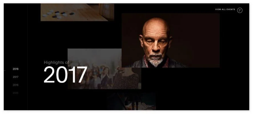
It highlights all the major Squarespace events that took place between 2003 and 2018, starting with the one below, which made me say, “whoa!”
“Anthony writes first lines of code for Squarespace from his dorm” - April 2003
2003?! That’s crazy! I feel like Y2K was just the other day!
And with that, I officially feel ancient. Allow me to distract myself from thoughts of my fleeting existence by giving you the lowdown of what we love about the site...
Why we love the Squarespace Timeline site:
The site has truly stood the test of time. It was released in 2018 and still looks as fresh as ever! That’s quite a feat considering how fast things change online.
Although I’m not a huge fan of Keanu Reeves’s acting, he certainly works well as a design element!
We like how the page transitions between the various events. Considering the site was built 2 years ago, it’s impressive that the transitions are relatively smooth.
It’s nifty that you can take a quick peek at the events by clicking on the hamburger menu. That way, you don’t have to wait for each event to load if you have limited time to browse.
We think Squarespace’s Timeline was a great way for them to showcase their achievements, and celebrate their 15-year anniversary! Take a look for yourself and see if you agree.
You’ve got the website inspiration, now it’s up to you!
Whether you’re building your own Squarespace site, or getting an expert to do it for you, a little inspiration can always help steer you in the right direction. I hope one or two of the sites that have inspired us can do the same for you!
And remember - if you’re too busy to build your own site, or if you’re simply struggling to put together a website with the WOW factor - we’re here to help! Get in touch and we can chat about how to create the Squarespace website that’s right for you.


